Seasonal Colour Theory
For designers seeking to elevate their design aesthetics, colour selection plays a pivotal role in creating visually appealing designs. The spring colour palette offers a versatile and dynamic range of colours that can evoke a sense of optimism, growth, and renewal. This article provides valuable insights into the distinct natures and seasons of colours, with a detailed exploration of the spring colour palette. By delving into the psychology of colour and how it affects human emotions, designers can create designs that resonate with their audience, create a memorable visual identity, and evoke positive emotions in their customers.

The History of Seasonal Colour Theory
The invention of colour theory dates back to the late 1660s when Sir Issac Newton used refraction to demonstrate that white light is composed of seven different colours. Later between the 1970s and 1980’s Bernice Kenter introduced the concept of Seasonal colour theory, which was initially used in the cosmetic industry to style a person in colours that most suit them based on their complexion, hair colour, and other features.
Branding, marketing, and designing experts now use this knowledge to develop and market all of their products, from high-grade e-commerce products to high-converting sales pages. Designers can benefit massively by using and applying these concepts of seasonal colour theory and colour combination to produce top-notch products and content for their clients. To understand which season the personality of your brand most relates to, one should have a thorough understanding of the different seasons in colour psychology, along with the different colour combinations that define these seasons.
Just like the four seasons of a year, there are four seasons in seasonal colour theory as well. You can choose which season suits your target audience the best by relating the characteristics that define your brand personality to the features of these four seasons. Here is a quick rundown of the four seasons, their characteristics, and the colours that best define them.
Spring Season
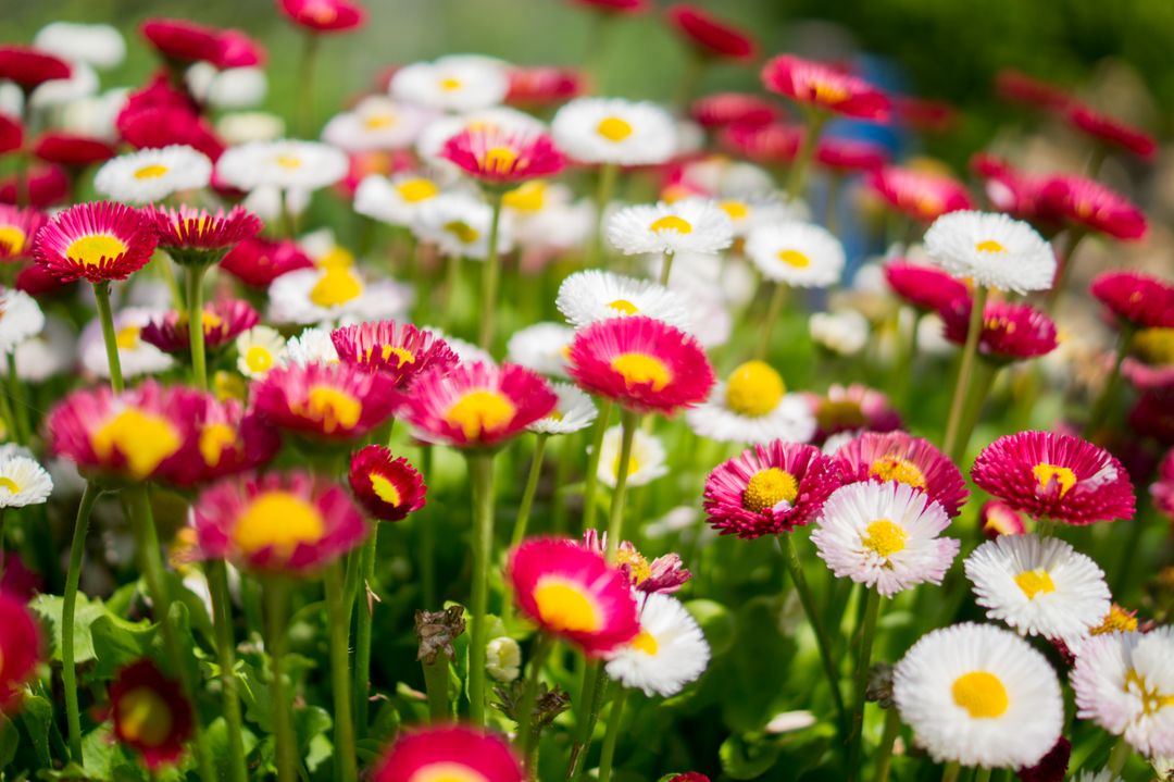
The spring season personality is energetic, cute, creative, bubbly, and fun-loving. This season and spring colour palette are loved by inspirational leaders, creatives, and high-energetic people who are fun to be around. The industries that go well with the spring colour palette include kid’s clothing and toys and creative industries like art and design.
The colours included in the spring colour palette include bright and warm shades like coral blue, sunny yellow, bright green, and many such colours.

Summer Season
The summer colour palette includes soft and mute colours. The personality of this season can be defined by traits of elegance, grace, creativity, luxury, and gentleness. The industries that fair well with the summer colour design and palettes are wedding planners, graphic designers, and florists. Neutral colours like light blue, cranberry red, and light pink are also included in the summer colours palette.
Autumn Season
The autumn season personality is warm, friendly, and loyal. The industries that love an autumn-colour vibe in their branding and marketing forefront are wellness communities, writers, and business coaches.
Like its personality traits, the autumn colour palette includes warm colours like mustard yellow, eggplant purple, and pumpkin orange, among many such warm colours.
Winter Season
The winter season’s personality is intense and can be best defined by being successful, highly driven, and decisive. The industries that love to showcase a winter colour palette include designers, technology, finance, and law.
The colours that make up a winter palette include hues like ruby red, sapphire blue, and emerald green. The winter palette is also one of the favourite choices of colour palettes for tech branding companies and logos.

Spring Colour Palette & Types
Any brand that uses the spring colour palette comes off as an approachable, fun, and vibrant brand personality. Spring colour palettes include many bright shades with warm undertones like soft pastels, bright and fresh greens, and yellows. We have gathered a flamboyant collection of colours that go well with the spring vibe and personality for you. Take a look.
Soft Pastels
Light and sombre pastel shades like pale pink, baby blue, and lavender are often associated with spring and are a popular choice for creating a soft and romantic aesthetic. These colours are often used in designs for weddings, baby showers, and other special events.
Bright Greens
Fresh greens like lime and mint are commonly used in spring colour palettes to create a sense of renewal and growth. These colours are often used in colour palettes for eco-friendly or sustainable brands, as well as designs for gardening and outdoor activities.
Warm Yellows
Pleasant yellows like buttercup and lemon are often used in spring colour palettes to create a sense of happiness and positivity. These colours are commonly used in designs for children’s products, as well as designs for spring-themed marketing campaigns.
Coral and Peach
Shades of coral and peach are popular selections for spring colour palettes, especially since the season of spring brings about feelings of joy and happiness. Their bright and vibrant colours may quickly raise the atmosphere and lend a playful flare to any design or clothing. These colours are often used in designs for fashion and beauty brands, as well as designs for spring-themed home decor.
Floral Colours
Floral hues are frequently used in spring colour palettes to represent the blooming of flowers throughout this season. Floral colours' gentle and delicate tones are typically linked with the freshness and rejuvenation that comes with spring. Incorporating flowers into design produces a sense of lightness, femininity, and fun, all of which are ideal for spring's bright and cheery atmosphere. Flowery colours include a colour combination of bright pinks, purples, and blues that are commonly used in spring colour palettes. These colours are oftenly used in fashion and home decor designs, as well as spring-themed events like garden parties.
All these colours can be used in various colour combinations to form beautiful spring colour palettes. The entire spring colour palette can be categorised under the following four types.
Warm Spring
The warm Spring colour palette is characterised by warm, sunny colours that evoke a sense of happiness and positivity and are used in a variety of design sectors, including fashion, graphic design, interior design, and product design. They provide apparel, accessories, cosmetics, websites, ads, social media, décor items, and packaging a new and colorful look, making them enticing to customers throughout the spring season.This palette includes warm yellows, corals, oranges, and other bright colours that are perfect for creating designs for spring-themed events and products.
Bright Spring
Bright spring colours are bright and vibrant. The colour palette includes bold, saturated hues like hot pink, turquoise, and electric blue. These colours are perfect for creating designs that are energetic and attention-grabbing, such as designs for fashion or beauty brands.
Light Spring
The light Spring colour palette includes soft, delicate colours like pale pink, lavender, and mint green. These colours are midway between spring and summer shades that offer a gentle and elegant vibe. These colours are perfect for creating designs with a romantic or feminine feel, such as designs for weddings or baby showers.
True Spring
True Spring’s colour palette includes bright, clear colours that are true to nature. This palette includes colours like true red, emerald green, and bright yellow. These colours are perfect for creating designs that are vibrant and eye-catching, such as designs for outdoor activities or eco-friendly products.

What Emotions Does a Spring Colour Palette Evoke
Spring is a season of hope and possibilities and is much anticipated after the dark and cool winters. This trait of the season is also followed by its colour palette. A spring colour palette evokes a sense of freshness, renewal, and optimism. The colours in a spring palette are often light, bright, and cheerful and are inspired by the colours found in nature during the spring season. They can be used for designing as it is or looks vibrant when used along with design with neon colours.
Some of the colours commonly associated with a spring palette include soft pastels like pink, lavender, and baby blue, as well as brighter hues like yellow and green. These colours are often described as light, airy, and playful and are known for their ability to create a sense of happiness and joy. On the other hand, colours like greens and warm shades of yellow and red evoke feelings of excitement and anticipation of good.
Spring colours can evoke a range of emotions, including.
Happiness:
The bright, cheerful colours of a spring palette can create a sense of happiness and joy, evoking feelings of positivity and optimism.
Renewal:
Spring is a time of revitalisation and growth, and the fresh, new colours of a spring palette can evoke feelings of new beginnings and fresh starts.
Playfulness:
Spring colours are often described as playful and whimsical, evoking a sense of fun and light-heartedness.
Serenity:
Soft pastels like pink and lavender can create a sense of calmness and serenity, which makes them ideal for designs that aim to create a peaceful atmosphere.
Overall, a spring colour palette is perfect for designs that aim to create a sense of happiness, positivity, and renewal. Whether you are designing for a product launch, marketing campaign, or website, incorporating spring colours can help you create visually appealing designs that resonate with your target audience.
Other businesses that can use the spring colour palette include copywriters, clothing brands, and kids’ toys.
How to Include Spring Colour Palette in Graphic Design
The combination of the feelings and aesthetics of a spring colour palette can be used in the branding and marketing of any business to gain organic reach and make a lasting impression on the customers. Including a spring colour palette in graphic design is a great way to evoke a sense of freshness, renewal, and optimism.
Not only the spring colour palette is a breath of fresh air in the bazaar of dull colours it also manages to grab the audience’s attention and can also help in making a fabulous brand that generates sales.
Here are some tips for incorporating a spring colour palette into your graphic design work.
Choose Your Colour Palette
Begin by selecting colours that are reminiscent of the spring season, such as soft pastels, bright pinks, and fresh greens. You can also mix in some bolder, more saturated colours to add some depth and contrast to your designs. A good yet outstanding choice will be to merge the spring palette with a brown colour design. Since designs with brown colours are neutral and dull, you can give a pop of colour to your graphic by using spring colours with it.
Use Colour Psychology
Consider the emotions that you want to evoke in your design, and use colour psychology to help guide your colour choices. All the colours of the colour wheel are known to evoke specific emotions. Align these emotions with your brand voice to have a strong brand image and design. For example, pink and lavender are often associated with calmness and serenity, while bright yellows and oranges can evoke feelings of happiness and optimism.
Create Contrast
When using a spring colour palette, it is important to create a contrast to ensure that your designs do not appear too soft or muted. If you want to create interest and contrast, experiment with pairing lighter pastels with bolder, more saturated colours. As mentioned above, colours like grey, brown, and white are some of the best options to create a smacking contrast for your design.
Consider Your Brand
If you are designing for a brand, it is important to ensure that your colour choices align with the brand’s personality, brand voice, and values. If your brand is playful and fun, a spring colour palette can be a great choice. However, if your brand is more serious or professional, you may want to consider using a more subdued colour palette. This practice brings forth a brand persona that gels well with its target audience and gets maximum reach.
Experiment with Textures and Patterns
Adding texture and patterns to your designs can help to create visual interest and depth. You can experiment with diverse textures and patterns that complement your chosen colour palette to create designs that are both visually appealing and engaging.
By incorporating a spring colour palette into your graphic design work, you can create designs that evoke a sense of freshness, renewal, and optimism. With the right colour choices, contrast, and textures, your designs can be visually compelling and engaging, effortlessly making you a distinguished designer.
Examples of Spring Colour Palettes in Graphic Design
Spring is the season of renewal, rejuvenation and reinvigoration. For designers, this means the opportunity to incorporate fresh and vibrant colour palettes into their work. In this list, we showcase some stunning spring colour palettes that will inspire you to create visually appealing designs.
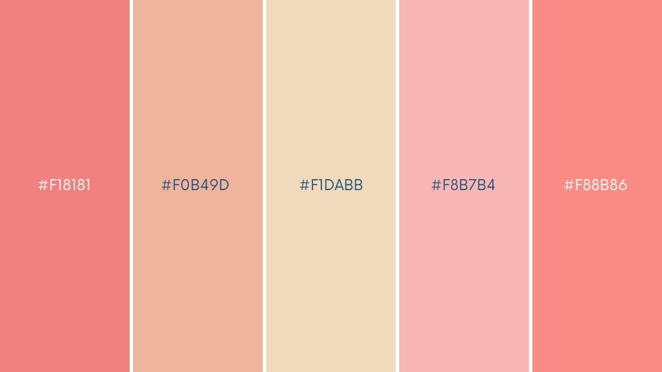
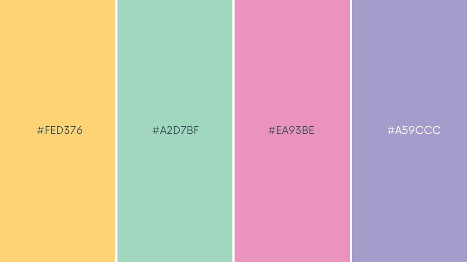
1. Gentle Awakening:
With pastel yellow and soft pink, this spring palette can be used for designing products featured by children and women products. They offer a refreshing and calming vibe that will surely be loved by the customers.
HEX CODES: #F7F7F7, #FED376, #A2D7BF, #EA93BE, #A59CCC
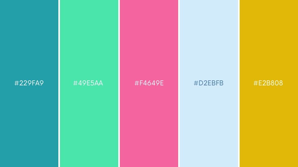
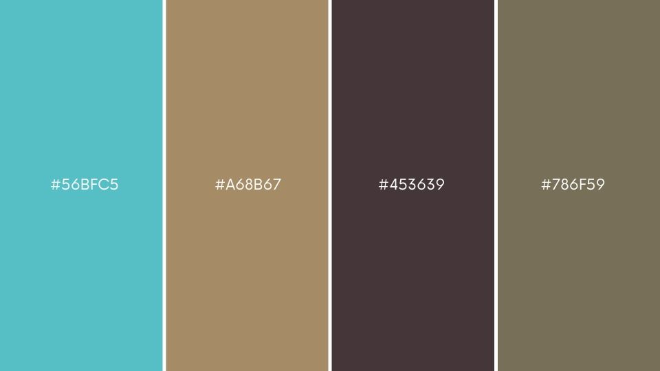
2. Robin’s Nest:
Complete with muted brown and blue, this palette is the perfect choice for a technology brand for the best brand outlook.
HEX CODES: #F4F5F5, #56BFC5, #A68B67, #453639, #786F59
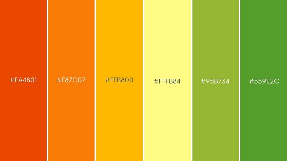
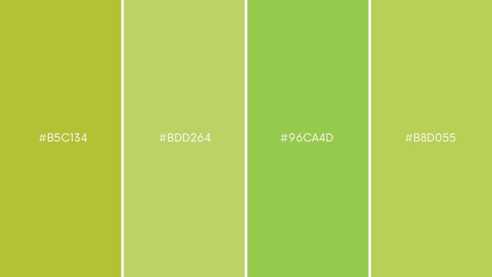
3. Grass Is Back:
This spring palette is a hug of freshness and renewal. Complete with both subtle and bold shades of green; this palette is all that is needed to form stunning designs for any wellness, food, or wellness brand.
HEX CODES: #F9F9F9, #B5C134, #BDD264, #96CA4D, #B8D055
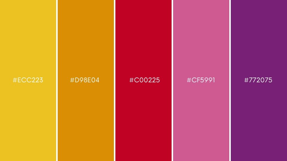
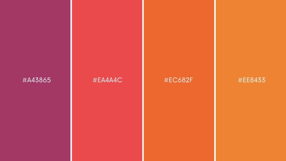
4. Sunset:
This spring palette evokes the feelings of an ecstatic warm day. This palette is the best choice for the food and beverage brand for a super stylish look that can also help them stand out in the crowd. A good example is Dunkin Donuts which uses two colours from this palette.
HEX CODES: #F7CF40, #A43865, #EA4A4C, #EC682F, #EE8433
Embrace the Colours of Spring in Your Next Design Project
Now that you know how spring colours can be paired and used in the form of different palettes, you can make use of the same to develop stunning designs that align with a similar brand personality, tone, and voice.
You can also create a palette of your liking. All you have to do is choose three to four colours of different hues and intensities and merge them to form a unique palette. This palette can be used for designing, branding, and marketing. Be creative, and do not forget to have fun while playing with these colours.

Rahul Shevde